
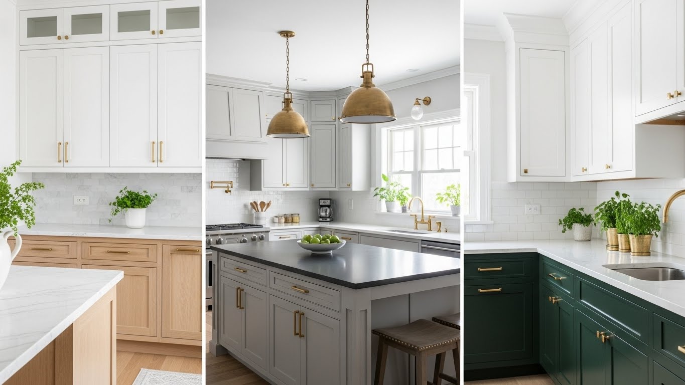
Choosing a kitchen color feels weirdly intense, right? You stand there with paint swatches, coffee in hand, wondering why one shade of white looks “cozy” and another looks like a dentist’s office. I’ve painted more kitchens than I care to admit, made a few regrettable choices, and learned a lot along the way.
So let’s talk—friend to friend—about 21 kitchen color ideas that actually work, look good, and won’t make you cringe six months later.
1. Classic White (Yes, Still Winning)

White kitchens never ghost us. They show up, look clean, and make spaces feel bigger.
I always recommend white when someone wants a safe but stylish option. White reflects light like a champ, which helps small or dark kitchens feel open. Ever noticed how white cabinets make countertops pop without trying too hard?
Why it works:
- Pairs with literally everything
- Feels timeless, not trendy
- Makes resale easier (FYI, buyers love it)
2. Warm Cream for Soft Contrast

White’s softer cousin deserves respect. Cream adds warmth without shouting for attention.
I used cream cabinets in one rental, and guests always asked if I hired a designer. Cream feels inviting, especially when you cook a lot and want that “come hang out” vibe. Doesn’t your kitchen deserve that energy?
3. Soft Gray That Plays Nice

Gray kitchens still hold strong, but you need the right tone. Skip anything that looks like a rainy Monday.
I lean toward warm gray with beige undertones because it avoids that cold, lifeless feel. Gray works best when you pair it with wood or brass accents. Who wants a kitchen that feels like a parking garage?
4. Greige (Because Indecision Happens)

Can’t choose between gray and beige? Greige saves the day.
This color blends warmth and neutrality without drama. Greige adapts to lighting like a pro, which helps if your kitchen changes moods throughout the day. IMO, greige works harder than most neutrals.
5. Navy Blue That Means Business

Navy brings confidence. It says, “Yes, I cook here, and yes, I know what I’m doing.”
I love navy lower cabinets with lighter uppers. Navy grounds the space while still feeling elegant. Ever noticed how navy somehow feels both bold and calm?
Best pairings:
- White countertops
- Gold or brass hardware
- Light wood floors
6. Sky Blue for Easy Breezy Energy

Sky blue keeps things chill. It feels light, fresh, and easygoing.
I once painted a tiny kitchen sky blue, and the room instantly felt happier. Light blue boosts calm energy, especially during chaotic mornings. Who doesn’t want that before coffee?
7. Sage Green That Soothes

Sage green feels like a deep breath in color form.
This shade connects kitchens to nature without trying too hard. Sage works beautifully with wood tones, white walls, and matte black hardware. Doesn’t your kitchen deserve a little zen?
8. Deep Forest Green Drama

Forest green brings the drama—in a good way.
I recommend this shade for confident homeowners who want personality. Dark green adds richness without feeling trendy or loud. Ever seen forest green cabinets under warm lighting? Yeah, stunning 🙂
9. Olive Green with Earthy Vibes

Olive green hits different. It feels grounded, cozy, and slightly vintage.
I love olive in kitchens with lots of natural light. Olive plays well with brass and stone, creating an earthy, layered look. Why not lean into nature a bit?
10. Sunny Yellow That Actually Works

Yellow scares people, but hear me out.
Soft, muted yellow adds warmth without screaming. I once used buttery yellow walls, and guests smiled the second they walked in. Yellow boosts energy, which helps when cooking feels like a chore.
11. Mustard for Retro Cool

Mustard feels bold, confident, and a little rebellious.
I wouldn’t paint every surface mustard, but accent cabinets? Yes. Mustard adds personality fast, especially in modern or mid-century kitchens. Ever want your kitchen to feel fun without going full circus?
12. Charcoal for Sleek Sophistication

Charcoal brings depth without going full black.
This shade works great in larger kitchens with good lighting. Charcoal cabinets feel modern and grounded, especially with light counters. Doesn’t a little contrast keep things interesting?
13. True Black (Use Carefully)

Black kitchens demand confidence. They reward you when you commit fully.
I’ve seen black kitchens look jaw-dropping with the right lighting. Black creates instant drama, but balance matters. Would you wear all black without accessories? Same rule here.
Balance tips:
- Add light countertops
- Use reflective finishes
- Maximize lighting
14. Soft Beige That Feels Cozy

Beige never tries too hard. It just shows up and works.
I recommend beige for traditional or farmhouse kitchens. Beige adds warmth without distraction, which helps busy spaces feel calmer. Who needs visual chaos while chopping onions?
15. Blush Pink (Yes, Seriously)

Blush pink surprises people—in the best way.
I tried blush cabinets once, fully expecting regret. Instead, I got compliments nonstop. Blush feels soft and modern, especially with gray or brass accents. Ever wanted a kitchen that feels welcoming and stylish?
16. Terracotta with Warm Soul
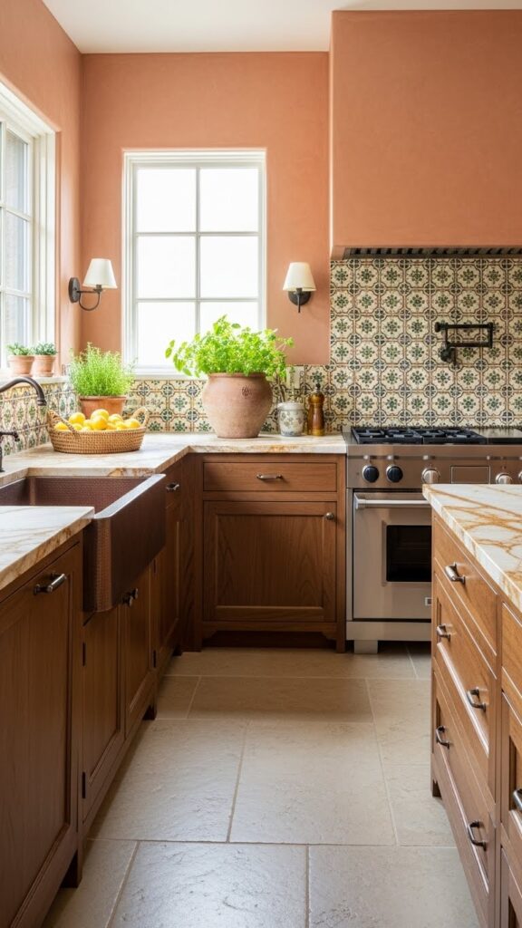
Terracotta brings warmth straight from the earth.
This color works beautifully in kitchens with natural materials. Terracotta adds richness and texture, especially with wood and stone. Why not let your kitchen feel sun-kissed?
17. Bold Teal for Personality
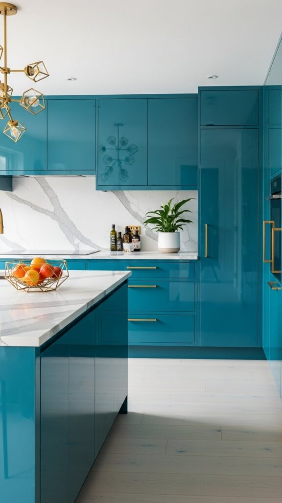
Teal kitchens don’t whisper. They speak clearly.
I love teal for homeowners who want character without chaos. Teal balances blue and green, which keeps it versatile. Ever noticed how teal feels both calm and bold?
18. Two-Tone Magic
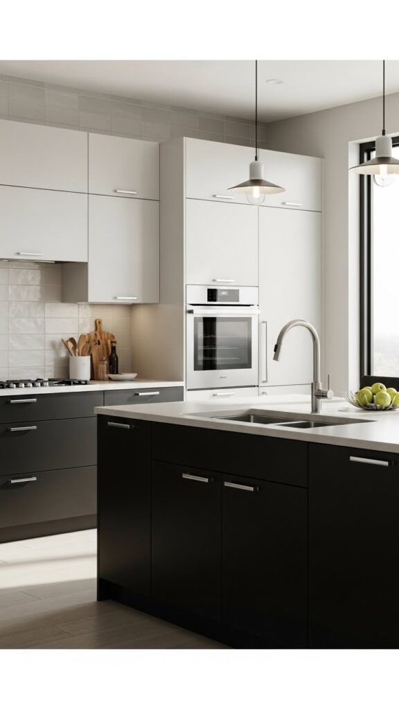
Two-tone kitchens add depth without overthinking.
I often suggest darker lower cabinets and lighter uppers. Two-tone designs create visual interest while keeping balance. Why choose one color when two work better?
19. Natural Wood Tones (Color Counts Too)

Wood acts like a color, and it deserves credit.
Natural wood cabinets bring warmth and texture instantly. Wood tones soften modern kitchens and add timeless appeal. Doesn’t real wood just feel right?
20. Moody Purple (Yes, Really)

Deep plum or aubergine works when done right.
I wouldn’t suggest bright purple, but rich, moody tones? Absolutely. Purple adds unexpected sophistication, especially with metallic accents. Ever want a kitchen that feels quietly bold?
21. Neutral Base with Color Pops

Sometimes restraint wins.
Neutral kitchens with colorful accents feel flexible and fun. You can swap accessories anytime, which keeps things fresh without repainting. Doesn’t that sound easier than repainting every year?
Easy color pop ideas:
- Bar stools
- Backsplash tiles
- Small appliances
Conclusion
Kitchen color choices feel personal because kitchens feel personal. You cook there, vent there, and maybe dance a little while waiting for water to boil. These 21 kitchen color ideas give you options that feel stylish, livable, and honest. Trust your gut, test samples, and remember—you can always repaint, but you can’t undo regret easily :/