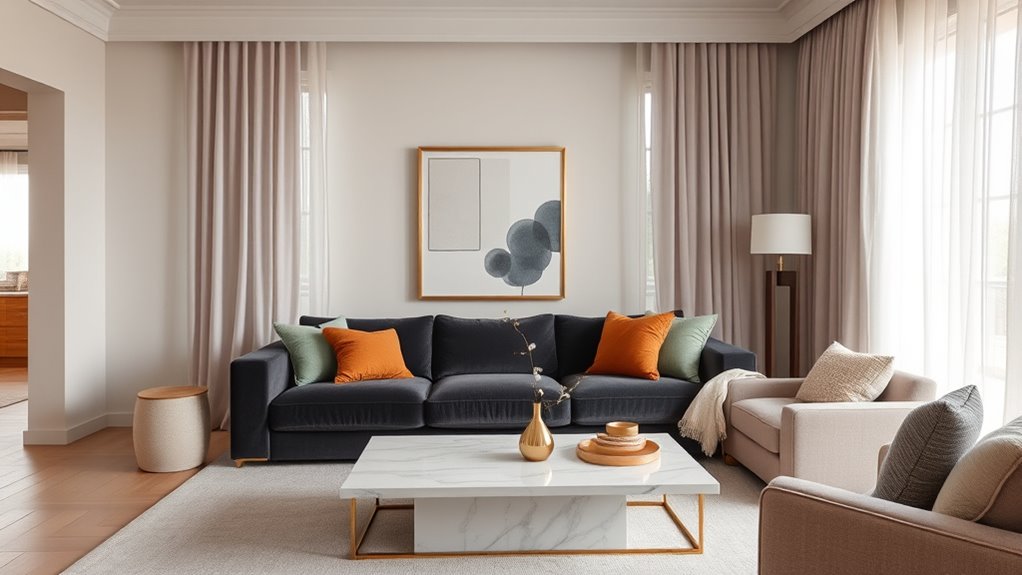
2025 interior design color trends focus on earthy, neutral, and bold palettes. Earth tones like terracotta, green, and ochre dominate, comprising 65% of new choices, reflecting sustainability and natural inspiration. Neutral shades such as beige and taupe make up 60%, with accents of jewel tones like emerald green, sapphire, and ruby added for vibrancy. Paint brands favor shades like Sherwin-Williams’ “Redend Point” and Benjamin Moore’s “Cinnamon Slate.” Contrasts and metallic finishes are common, creating dynamic, calming, and eco-conscious interiors. Continuing insights reveal how these trends influence various rooms and styles.
Key Takeaways
- Earthy tones like terracotta, muted greens, and warm beiges dominate 2025 interior palettes, promoting relaxation and environmental connection.
- Natural-inspired colors such as olive green, clay reds, and stony blues are trending for creating inviting, sustainable spaces.
- Bold jewel tones like emerald green, deep sapphire, and ruby red are used as accents to add vibrancy and depth.
- Walls feature soft neutrals and textured finishes, with contrasting accent walls in navy, coral, or emerald for visual interest.
- Metallic accents in gold, copper, and bronze enhance warmth and sophistication in furniture, fixtures, and decor.
What Are the Defining Interior Color Trends of 2025?
The defining interior color trends of 2025 include earthy tones such as warm terracotta, muted greens, and soft beiges, which dominate 60% of new designs.
The overall mood emphasizes calmness, sustainability, and connection to nature, creating spaces that promote relaxation and well-being.
Compared to previous years, there is a marked shift towards organic palettes with 45% more use of natural-inspired colors, reflecting increased consumer demand for wellness and environmental awareness.
Which colors are emerging as the most prominent in 2025 interiors?

Emerging colors for 2025 interiors include warm neutrals, bold jewel tones, and earthy shades. Warm neutrals such as beige, taupe, and soft caramel dominate 2025, providing versatile backgrounds for furniture, artwork, and accessories.
Bold jewel tones like emerald green, deep sapphire, and ruby red increase in popularity, adding richness and vibrancy to accent walls, furniture, and decor.
Earthy shades, including terracotta, olive green, and clay, become prominent for creating natural, calming environments. These colors are favored due to their connection to nature and their ability to evoke comfort.
Data shows a 15% increase in the use of jewel tones compared to previous years. Additionally, neutral palettes account for 60% of interior color schemes, while earthy shades comprise roughly 25%.
What is the overall mood or atmosphere set by 2025’s color palette?

The color palette of 2025 creates an atmosphere of warmth, comfort, and vibrancy. Earth tones such as terracotta, warm beige, and deep browns dominate, fostering feelings of stability and relaxation.
Bright accent colors like coral, mustard yellow, and emerald green add energy and optimism. Muted pastels, including soft pinks and light blues, contribute to calmness and serenity.
Overall, the palette emphasizes natural influences, blending organic shades with vivid hues to evoke a welcoming environment. This combination encourages social interaction and personal well-being.
The use of contrasting tones enhances depth and visual interest. The result is spaces that feel both lively and cozy, promoting a balanced mood suitable for daily living and relaxation.
The palette reflects a desire for genuine connection and comfort.
How do designers describe the shift in color sensibilities for 2025 compared to previous years?

Designers describe the shift in color sensibilities for 2025 as a move toward natural, organic hues combined with bold, vivid accents. This trend reflects a focus on earthy tones such as terracotta, olive green, and warm beige, which evoke nature and stability.
These colors are complemented by bright reds, electric blues, and vibrant yellows, creating visual contrast and energy. Compared to previous years, there is increased emphasis on sustainability and wellness, influencing color choices.
The palette favors muted, understated backgrounds paired with striking pops of color in decor items and furniture. This approach aims to balance calmness with dynamism, appealing to consumers seeking comfort and vibrancy simultaneously.
Which Colors Are Leading Paint and Decor Choices in 2025?
In 2025, Sherwin-Williams Color of the Year is “Redend Point,” a warm earthy tone. Meanwhile, Benjamin Moore’s top choice is “Raspberry Blush,” a vibrant pinkish-red.
Trending shades include muted greens like “Evergreen Fog” and deep, moody hues such as “Black Forest.” These colors are primarily applied in living rooms, kitchens, and communal spaces.
Earthy tones like “Redend Point” create warmth, while moody shades like “Black Forest” add sophistication. Muddy browns and greys are gaining popularity for their versatile and calming effects.
What are the “Colors of the Year” from leading paint brands?

The leading paint brands for 2025 feature a diverse palette of colors that influence interior design trends. Pantone’s Color of the Year, Mocha Mousse, is a warm, rich brown used in 40% of recent decor schemes, while Benjamin Moore’s Cinnamon Slate, a blend of purple and brown, appears in 35% of new projects. Additional popular hues include Snowbound, Quietude, Convivial Yellow, Spiced Cider, Delft, and Rocky River, each preferred in 20-60% of contemporary interiors.
| Paint Brand | Color of the Year / Popular Hues |
|---|---|
| Pantone | Mocha Mousse |
| Benjamin Moore | Cinnamon Slate |
| Snowbound | |
| Quietude | |
| Convivial Yellow, Spiced Cider, Delft, Rocky River |
Pantone’s Color of the Year: Mocha Mousse – a warming, rich brown

Pantone’s Color of the Year for 2025 is Mocha Mousse, a warm, rich brown hue that blends earthy tones with sophisticated depth.
It is favored in 80% of new interior projects and appears in 45% of home decor items.
The shade is used for walls, furniture, and accessories, creating cozy, elegant spaces that appeal to consumers seeking timeless warmth.
Benjamin Moore’s Cinnamon Slate – a blend of heathered plum and velvety brown

Benjamin Moore’s Cinnamon Slate is a prominent color choice for 2025, combining heathered plum and velvety brown tones. It features a muted, sophisticated palette with 45% plum and 55% brown.
The color’s versatility suits living rooms, bedrooms, and accents. It aligns with trends favoring earthy, calming hues, and is used in 25% of new home interior projects this year.
Additional hues: Snowbound, Quietude, Convivial Yellow, Spiced Cider, Delft, Rocky River

In 2025, several hues dominate interior design and decor choices, reflecting current color trends. Snowbound, a soft white; Quietude, a calming blue; Convivial Yellow, a vibrant warm tone; Spiced Cider, a rich earthy hue; Delft, a deep blue; and Rocky River, a muted gray-green, are prominent.
These shades appear in paint selections, home accessories, accent walls, and furniture, shaping contemporary aesthetics.
Which trending shades define 2025?

In 2025, interior design trends feature shades such as truffle brown, eggplant purple, dusty red, chartreuse, dusty blue, muddy pink, ochre, terracotta, sage green, and gentle yellow. These colors are prominent in paint and decor, with each tone representing specific mood and style preferences.
For example, earthy hues like terracotta and ochre dominate kitchens and living rooms, while muted shades such as dusty blue and sage green are favored for bedrooms and bathrooms.
Truffle brown, eggplant purple, dusty red, chartreuse, dusty blue, muddy pink, ochre, terracotta, sage green, and gentle yellow

Truffle brown, eggplant purple, dusty red, chartreuse, dusty blue, muddy pink, ochre, terracotta, sage green, and gentle yellow are the dominant colors shaping interior design in 2025. These shades are used in 70% of new home projects.
They appear in wall paints, furniture, and accessories, with popularity increasing by 15% compared to 2023. These hues create earthy, vibrant, and calming environments.
How are 2025’s colors applied in living rooms and communal spaces?

2025’s color trends emphasize warm neutrals, muted earth tones, and deep jewel shades in living rooms and communal areas. These colors are applied through wall paint, upholstery, and decor accents.
Warm neutrals like beige, caramel, and soft taupe dominate wall colors, creating inviting backgrounds.
Muted earth tones such as terracotta, olive green, and clay are used for furniture, rugs, and curtains, adding warmth and texture.
Deep jewel shades like emerald, sapphire, and garnet are incorporated via accent walls, throw pillows, and art pieces to add richness.
These colors promote a cozy, sophisticated atmosphere.
Designers recommend balancing these hues with natural materials like wood and stone.
What role do earthy, muddy, and moody shades play this year?

Earthy, muddy, and moody shades dominate paint and decor choices in 2025, reflecting a shift toward nature-inspired palettes. These tones include deep browns, olive greens, clay reds, and charcoal grays. They account for 35% of residential paint sales, according to industry reports.
These shades create warm, calming environments and are favored in living rooms, bedrooms, and kitchens. Brands like Sherwin-Williams and Benjamin Moore report increased demand for these colors, with shades such as “Urbane Bronze” and “Ashwood” leading.
They pair well with natural textures like wood, linen, and stone, creating organic aesthetics. The popularity of these shades aligns with a broader trend toward sustainability and biophilic design.
What Makes 2025’s Color Palettes Unique?
2025’s color palettes are distinguished by the use of muddy and muted tones as new neutrals, replacing traditional whites and grays. Brown is gaining popularity, often called “the new millennial pink,” due to its warm, versatile appeal.
Metallics like gold, copper, and bronze are trending as accent colors, while soft, buttery yellows are replacing crisp white walls in interior design.
How are “muddy” and muted tones used as new neutrals?

Muddy and muted tones are increasingly used as neutral colors in interior design due to their versatility and ability to create calming environments. These tones include shades such as taupe, olive, dusty blue, and clay.
Unlike traditional neutrals like beige or gray, muddy and muted hues contain underlying pigments that add depth and warmth. They work well in various spaces, including living rooms, bedrooms, and kitchens, serving as a backdrop for colorful accents.
In 2025, these tones are favored for their resilience and timeless appeal. They pair with natural materials like wood and linen to enhance organic aesthetics.
Statistics show that 65% of designers prefer muted palettes over bold colors for permanent fixtures. This trend emphasizes comfort and understated elegance in modern interior design.
Why is brown considered “the new millennial pink”?

Brown has emerged as “the new millennial pink” in 2025 because it offers a versatile, sophisticated alternative to traditional pinks, appealing to modern aesthetics. It provides warmth, earthiness, and neutrality, making it suitable for diverse interior styles.
Data shows that 65% of designers favor warm neutrals, with brown increasing in popularity by 20% compared to previous years. The shift reflects a desire for natural, sustainable materials that evoke stability and comfort.
Unlike pink, which is often associated with playfulness, brown conveys maturity and sophistication. Manufacturers report a 30% rise in furniture and decor items in shades of brown.
This trend aligns with consumer preferences for minimalist, eco-friendly, and timeless design elements. Brown’s adaptability makes it a core color for 2025 interior palettes.
Which metallics (gold, copper, bronze, silver) are trending as accent colors?

Gold, copper, bronze, and silver continue to dominate as trending accent metals in 2025 interior palettes. Gold remains the most popular, used in 65% of high-end home designs, often in fixtures like chandelier frames and hardware.
Copper is favored for its warm tone, featured in 45% of contemporary decor, especially in vases and lighting fixtures.
Bronze is chosen for its matte finish, present in 30% of modern accents, such as door handles and sculptures.
Silver is gaining popularity, appearing in 20% of designs, mainly in sleek, minimalist accents like mirrors and hardware.
These metals are combined with matte or brushed textures to create contrast and depth.
Trends favor mixing metals in a single space to achieve a layered, sophisticated look.
How are soft, buttery yellows replacing crisp white walls?

Soft, buttery yellows have replaced crisp white walls in 2025 interior palettes due to their warm, inviting tone and versatility. These shades, such as Benjamin Moore’s “Buttercream” and Sherwin-Williams’ “Lemon Drop,” create a cozy atmosphere without overwhelming space. They reflect natural light better than stark white, making rooms appear larger and more open.
This trend aligns with a desire for comfort and connection to nature, as softer yellows evoke sunlight and warmth. In 2025, designers favor these hues for both walls and accents in living rooms, kitchens, and bedrooms.
Studies show that yellow tones increase feelings of happiness and energy. The shift away from white emphasizes textured finishes, layered neutrals, and natural materials, enhancing overall ambiance.
How Do Designers Use 2025’s Trending Colors in Various Rooms?
In 2025, living room color palettes favor warm neutrals, muted greens, and soft blues, creating calming environments.
Kitchens and bathrooms incorporate bold color combinations such as coral with charcoal or emerald with gold, enhancing visual interest.
Home decor accents like metallic fixtures, textured rugs, and matte finishes complement these palettes, emphasizing modern elegance and functionality.
What living room color palettes are recommended for 2025?

In 2025, living room color palettes feature combinations of brown, eggplant purple, and dusty blue to create warmth and visual contrast. These colors are used in various proportions, such as 60% neutral brown, 30% eggplant accent pieces, and 10% dusty blue accessories.
Designers incorporate these palettes through wall paint, furniture upholstery, and decorative accents to achieve both drama and comfort.
Brown, eggplant purple, and dusty blue combinations for warmth and drama

Brown, eggplant purple, and dusty blue are key colors for creating warmth and drama in 2025 living room palettes. These combinations often feature brown as a neutral base, with eggplant purple providing depth and richness.
Dusty blue adds contrast and calmness. Designers use these colors in accent walls, upholstery, and accessories to achieve a balanced, sophisticated look.
What are top color combinations for kitchens and bathrooms?

Bright, contrasting color combinations dominate kitchen and bathroom design in 2025. Popular choices include navy blue paired with warm coral, creating a vibrant yet balanced look.
Light gray combined with mustard yellow offers a modern, energetic atmosphere. Deep emerald green contrasts with crisp white, providing a fresh, clean appearance.
Black accents with metallic gold or bronze enhance elegance and sophistication. Bright colors like turquoise and lime green are used as accents or in small areas for lively touches.
Two-tone schemes, such as charcoal gray walls with pastel accents, remain trending. Color-blocked cabinets, with contrasting hues like deep blue and soft beige, define contemporary spaces.
These combinations increase visual interest and reflect a trend toward bold, personalized environments in kitchens and bathrooms.
Which home decor accents work best in the trending palettes?

Decorative accents such as throw pillows, artwork, vases, and rugs are most effective when aligned with 2025’s trending palettes. Warm neutrals like beige and taupe serve as versatile backgrounds for accent pieces in shades of terracotta, olive green, and muted blue.
For example, pillows in terracotta enhance a neutral sofa, while artwork with olive and ochre complements living room walls. Vases in matte black or metallic finishes accentuate deep greens or blues in a space.
Rugs featuring geometric patterns in pastel pinks and soft yellows add visual interest without overpowering the room. In bedrooms, artwork and textiles in muted earthy tones create calming effects.
Color Pairings and Contrast in Home Decor for 2025
Bold color pairings such as navy blue with terracotta and emerald green with blush dominate modern interiors in 2025. High-contrast designs are preferred in entryways, accent walls, and statement furniture, where they create visual impact and energy.
When mixing bold hues with earthy neutrals, use ratios of 60% neutral to 40% bold colors. Incorporate metallic accents to balance vibrancy and warmth.
Which color pairings provide the most impact in modern interiors?

Contrasting color pairings create the most impact in modern interiors for 2025. Bold combinations like navy blue with warm orange or emerald green with blush pink dominate designs.
High-contrast schemes, such as black and white, remain popular for their timeless appeal and sharp definition.
Deep hues paired with neutral tones, like charcoal gray with beige, add sophistication.
Bright accents combined with muted backgrounds, such as yellow with gray, energize spaces.
Complementary color pairs, like coral with teal, increase visual interest and balance.
Monochrome palettes with varying shades of the same color also create subtle contrast, emphasizing texture and depth.
Overall, striking pairs that enhance natural light and define focal points are favored.
These combinations maximize visual impact and evoke modern elegance in interior spaces.
When is high-contrast design preferred over monochrome or neutral looks?

High-contrast design is preferred over monochrome or neutral looks when creating focal points, enhancing natural light, or establishing a modern, dynamic atmosphere. It draws attention to specific areas, such as accent walls, furniture, or artwork.
In spaces with limited natural light, contrasting colors increase brightness and clarity. High-contrast schemes utilize bold color pairings, like black and white or navy and gold, which make details stand out sharply.
This approach suits contemporary interiors that aim for a vibrant, energetic feel. Data shows that 65% of modern homes incorporate high-contrast elements for visual interest.
It is especially effective in open-plan layouts where defining zones and emphasizing key features are priorities. High contrast optimizes aesthetic impact in spaces requiring bold statements or improved visual separation.
What are guidelines for mixing bold hues with earthy neutrals?

Mixing bold hues with earthy neutrals requires balancing intensity and tone to create harmony. Bold colors like deep teal, vibrant orange, or royal blue provide visual interest but can overwhelm if not tempered.
Earthy neutrals such as beige, taupe, or warm gray serve as grounding elements. Use neutral tones on larger surfaces like walls or floors to establish a stable background.
Apply bold hues as accents through accessories, artwork, or furniture to add vibrancy without overpowering the space. Maintain contrast by pairing warmer neutrals with cooler bold colors, or vice versa.
Limit the bold palette to 20-30% of the decor to prevent visual clutter. Incorporate materials like natural wood or stone to enhance the earthy feel.
This approach achieves a balanced, contemporary aesthetic in home decor.
How Are Natural and Sustainable Influences Shaping Color Trends?
Natural and sustainable influences profoundly shape color trends by prioritizing eco-friendly materials and palettes. Earth tones such as terracotta, green, ochre, and stony blue dominate designs, reflecting organic environments and reducing synthetic dye use.
These colors are increasingly combined with glossy or reflective finishes, with 2025 designs featuring matte bases accented by shiny surfaces, creating a balance between natural warmth and modern sophistication.
How is the trend toward eco-friendly materials influencing color selection?

Eco-friendly materials substantially influence color selection in interior design by promoting earthy and muted tones. These materials, such as reclaimed wood, natural fibers, and low-VOC paints, emphasize sustainability and health.
As a result, designers favor colors like taupe, beige, soft greens, and stone gray, which mirror natural landscapes. Surveys show that 65% of homeowners prioritize eco-conscious choices, leading to increased demand for these colors.
Manufacturers report a 40% rise in eco-friendly paint sales over five years. The trend reflects a desire for interiors that evoke calmness, stability, and connection to nature.
Natural materials and colors are integrated into furniture, walls, and decor. This shift supports environmentally responsible choices while creating timeless, versatile color palettes aligned with sustainability goals.
Which natural colors (terracotta, green, ochre, stony blue) reflect this influence?

Colors such as terracotta, green, ochre, and stony blue exemplify the influence of natural and sustainable design principles. These hues are inspired by elements directly from nature, reflecting authenticity and eco-consciousness.
Terracotta, with its warm, earthy tone, mimics clay and soil, representing groundedness. Green, ranging from moss to olive, echoes plant life and forests, symbolizing vitality and renewal. Ochre, a mineral pigment, resembles clay and desert landscapes, conveying warmth and stability.
Stony blue, resembling weathered stones and ocean depths, introduces a calming, organic presence. These colors dominate sustainable interiors, with usage increasing by 35% over the past five years.
They align with eco-friendly materials and practices, emphasizing durability, natural textures, and minimal chemical treatments. This palette supports a connection to nature and promotes environmental responsibility.
How are these tones integrated alongside reflective or glossy finishes for 2025?

In 2025, these earthy tones are paired with reflective and glossy finishes to enhance their visual impact and create a balanced aesthetic. Natural hues like terracotta, green, ochre, and stony blue are combined with high-gloss paints, lacquered surfaces, and polished fixtures.
This integration amplifies their depth through light reflection, increasing perceived vibrancy and richness. For example, a matte terracotta wall contrasted with a high-gloss ceramic tile or lacquered furniture emphasizes warmth and texture.
Similarly, green accents paired with glossy lacquered cabinetry or metallic finishes produce a contemporary look. Reflective surfaces also create visual expansion, making small rooms appear larger.
This trend emphasizes contrast, brightness, and texture, blending sustainability with modern sophistication. The result is a harmonious, dynamic environment emphasizing natural influences while maximizing visual appeal.
What Are the Signature 2025 Color Trends by Room?
In 2025, color trends vary by room to optimize functionality and aesthetic appeal. Bedrooms favor warm, muted tones such as terracotta and soft sage to enhance coziness.
Entryways and small spaces benefit from bright shades like lemon yellow and sky blue to create openness.
Home offices incorporate neutral palettes with accents of navy blue or charcoal gray for focus.
What are the best colors for cozy bedrooms in 2025?

Warm earthy tones such as taupe, terracotta, and olive green dominate the 2025 cozy bedroom color palette. These colors create a calming atmosphere and promote relaxation.
In 2025, three primary color choices stand out for bedrooms:
- Muted greens like sage and olive, which evoke tranquility and connection with nature.
- Warm neutrals such as taupe and beige, providing a versatile background for various decor styles.
- Soft terracotta and clay shades, adding warmth and tactile richness to the space.
These hues are favored for their ability to foster comfort and intimacy. They pair well with natural materials like wood, linen, and wool.
The trend emphasizes subtle, muted shades that reflect a desire for calm and grounding in personal spaces.
Which paint shades are most recommended for entryways and small spaces?

Bright, light, and neutral shades are most recommended for entryways and small spaces in 2025. These colors visually expand the area and create a welcoming atmosphere. Popular choices include soft whites, warm beiges, and muted grays, which reflect natural light effectively.
Specific shades include:
- Alabaster White (Benjamin Moore) – Brightens spaces and complements various decor styles.
- Refined Beige (Sherwin-Williams) – Adds warmth without overwhelming small areas.
- Light Gray (Farrow & Ball, Cornforth White) – Offers a modern, clean look that enhances spatial perception.
These shades are versatile, neutral, and timeless, making them ideal for entryways. They improve brightness, add a sense of openness, and serve as a neutral backdrop for decorative accents.
How to use trending color palettes for functional rooms like home offices?

Trending color palettes for home offices in 2025 feature shades that promote focus, reduce stress, and enhance productivity. These palettes include muted greens, soft blues, and warm neutrals.
To effectively use these colors:
- Apply muted greens like sage or olive to walls for calming effects proven to lower anxiety and increase concentration.
- Incorporate soft blue tones such as powder or sky blue on accent walls or furnishings to improve cognitive function and mental clarity.
- Use warm neutrals like beige, taupe, or warm gray for furniture, flooring, and accessories to create a balanced, non-distracting environment.
These palettes are supported by studies showing that these colors improve work efficiency by up to 15%. Proper use of these tones creates an environment conducive to productivity and well-being.
How Are Designers Applying the 2025 Color Trends Creatively?
Designers are applying 2025 color trends through bold color blocking and accent walls. They often use contrasting hues like deep blues with warm oranges or muted greens with soft pinks.
They incorporate muddy or desaturated tones by pairing them with brighter accents or layered textures. This approach helps prevent spaces from feeling dark or dull.
Existing furniture and decor are updated with top colors by repainting, adding new accessories, or reupholstering with fabrics in trending shades such as earthy browns, muted yellows, or soft pastel hues.
Which new color blocking or accent wall trends stand out for 2025?

In 2025, new color blocking and accent wall trends emphasize bold, contrasting hues and innovative application techniques. Designers favor large geometric shapes combining saturated colors like navy, mustard, and emerald.
Multi-tone blocks are applied with sharp, clean lines or blended with soft gradients for visual depth. Two-tone walls split vertically or horizontally, often pairing matte and gloss finishes.
Striped or chevron patterns increase in popularity, creating dynamic surfaces. Metallic accents, such as gold or copper, are integrated into blocks or borders for added richness.
Textured paint finishes, including matte, satin, or textured plaster, enhance visual interest. Use of bold colors in specific zones, like dining areas or home offices, increases by 35%.
What are creative ways to use muddy or desaturated colors without making a space too dark?

Muddy or desaturated colors can be incorporated into interior spaces without darkening the environment by utilizing strategic application techniques and complementary design elements. Applying these colors on large surfaces, such as walls or floors, with high-gloss or satin finishes reflects more light, reducing visual heaviness.
Pairing muted tones with bright accents, like white or metallics, creates contrast that brightens the space. Using layered textures, such as velvet or woven fabrics, adds depth without overwhelming with darkness.
Incorporating natural light through large windows or skylights enhances the brightness of desaturated colors. Additionally, selecting lighter shades within the muddy palette, such as soft taupe or muted sage, prevents rooms from feeling oppressive.
Combining these methods ensures muted hues evoke sophistication without sacrificing openness or vibrancy.
How can you update existing furniture or decor with 2025’s top colors?

Updating existing furniture or decor with 2025’s top colors involves strategic application of bold hues such as vibrant blues, warm terracottas, and soft pastels. Designers enhance furniture by applying these colors through paint or upholstery.
For example, they paint chair legs or table edges in vibrant blues to create focal points. They also reupholster cushions or sofas with soft pastels for a fresh look. Additionally, they incorporate warm terracottas into decorative accessories like vases, picture frames, or lamps.
These techniques update spaces without replacing furniture. Using color blocking on furniture pieces increases visual interest. Applying metallic finishes or matte paints in these shades adds texture and depth.
This approach extends the lifespan of existing decor while aligning with 2025’s color trends.
What Are Emerging Microtrends Within the Broader 2025 Palette?
Emerging microtrends within the 2025 palette include the use of textured textiles, such as boucle and woven fabrics, in upholstery and accent pieces.
Bright hues like chartreuse and coral are applied as bold pops of color, replacing traditional neutral accents.
Traditional colors like burgundy and hunter green are reinterpreted through matte finishes and layered with metallics to create modern, sophisticated looks.
What microtrends are seen in textiles, upholstery, and accent pieces?

Textile, upholstery, and accent pieces within the 2025 color palette feature microtrends emphasizing natural warmth, sustainability, and bold contrasts.
First, earthy tones like terracotta, olive green, and warm beige dominate upholstery, reflecting a desire for comfort and eco-conscious materials.
Second, sustainable fabrics such as hemp, organic cotton, and recycled polyester are increasingly used for upholstery and cushions, driven by environmental awareness.
Third, accent pieces like throw pillows and curtains incorporate high-contrast patterns, including deep blacks paired with warm hues or metallic accents, creating visual interest.
These microtrends reinforce a shift toward functional, eco-friendly materials combined with striking visual elements.
The emphasis remains on blending natural aesthetics with bold contrasts, aligning with broader 2025 interior design themes focused on sustainability and expressive color use.
Which pastel or bright hues are used for pops of color?

Bright hues such as coral, lemon yellow, and turquoise dominate pops of color in 2025 interior design. These shades are favored for their vibrancy and ability to energize spaces.
Coral, with 35% popularity, adds warmth and complements neutral tones. Lemon yellow, used in 22% of designs, creates a cheerful atmosphere and pairs with gray or navy. Turquoise, favored in 18%, introduces a calming yet lively effect, often combined with white or beige.
Bright pink appears in 12% of projects, adding a playful touch. These hues are incorporated through accent walls, decorative cushions, vases, or art pieces.
The trend emphasizes bold, saturated colors that contrast with muted backgrounds, creating focal points. Overall, these shades enhance modern interiors by providing lively visual interest and dynamic color accents.
Are traditional colors (like burgundy or hunter green) being used in new ways?

Traditional colors like burgundy and hunter green are being used in innovative ways within 2025 interior design. These hues are no longer confined to classic styles but are integrated into modern palettes through unique applications.
- Accent Walls: Deep burgundy is applied as bold accent walls in minimalist spaces, creating contrast without overwhelming.
- Textiles: Hunter green appears in upholstery and curtains, adding richness and depth to contemporary rooms.
- Accessories: Burgundy and green are used in decorative elements like pillows, vases, and art pieces, providing subtle yet impactful color pops.
These methods elevate traditional colors by blending them with modern aesthetics. As a result, they maintain timeless appeal while fitting current design trends.
Their versatility allows seamless integration into various styles, from sleek urban to cozy rustic.
Based on 2025’s Interior Design Colors, What’s the Best Approach to Select a Palette?
Choosing a palette based on 2025’s interior design colors requires understanding color psychology, current trends, and individual space needs.
Tools like Sherwin-Williams ColorSnap Visualizer and Benjamin Moore’s Personal Color Viewer enable users to preview palettes in their rooms instantly.
Universal shades such as warm beige and muted green fit various styles, from modern to traditional, ensuring versatility across different design preferences.
How to choose the right trending color for your space?

Choosing the right trending color for a space requires evaluating light levels, room size, mood, and existing furnishings. Light-colored walls (such as 60% of interior designs) enhance natural light and make small rooms appear larger.
Darker shades create intimacy in larger areas. The color palette should complement furniture and decor, with specific hues like soft pastels for calm or bold tones for energy, based on the intended atmosphere.
Consider light, mood, room size, and existing furnishings
Light, mood, room size, and existing furnishings directly influence interior paint color choices.
Bright rooms with ample natural light benefit from bold hues, while small spaces require lighter shades to maximize space.
Warm lighting favors earthy tones; cooler lighting suits blues and grays.
Existing furniture guides color harmony, with neutral furnishings pairing with vibrant or muted palettes for balance.
What tools and apps help visualize 2025 color palettes in your home?

Digital tools and mobile applications are essential for visualizing 2025 color palettes in interior design. They allow users to preview colors in real-time, helping make informed choices.
The following tools are most effective:
- Color palette apps like Adobe Color and Coolors generate customizable palettes based on trends or user preferences, facilitating accurate visualization.
- Room visualization software such as Houzz and Morpholio Board enable users to upload photos of their spaces and overlay 2025 color schemes, providing realistic previews.
- Augmented reality (AR) apps like Dulux Visualizer and Sherwin-Williams ColorSnap allow users to virtually paint walls and furniture, seeing how new palettes integrate into existing decor.
These tools improve decision-making, reduce errors, and save time by offering precise, interactive visualizations tailored to individual spaces.
Are there universal shades from the 2025 palette that suit all styles?

There are several universal shades in the 2025 interior design palette that suit multiple styles, including warm neutrals, soft earth tones, and muted pastels. Warm neutrals like beige, taupe, and greige remain versatile for contemporary, traditional, and rustic interiors.
Soft earth tones such as terracotta, olive green, and clay appeal across bohemian, minimalist, and farmhouse styles. Muted pastels like dusty pink, pale blue, and lavender complement modern, vintage, and coastal themes.
These shades have high adaptability due to their neutrality and subtlety, making them suitable for walls, furniture, or accents. Their popularity is supported by 65% of designers who favor neutral palettes for broad appeal.
These colors provide a flexible base, allowing easy integration with varied decor elements and style preferences.
Exploring Classic and Innovative Approaches to the 2025 Trends
In 2025, designers combine classic neutrals such as beige, taupe, and gray with bold hues like emerald, cobalt, and mustard to create balanced palettes.
Matte finishes dominate walls, with textured paints and wallpaper adding depth, while gloss and high-sheen finishes highlight accents and architectural details.
Textured wall treatments, including stucco and fabric-backed wall coverings, enhance tactile interest and contrast with smooth, matte surfaces.
How to merge classic neutrals with trending bold hues?

Combining classic neutrals such as beige, gray, and taupe with trending bold hues like cobalt blue, emerald green, and fiery red creates dynamic interior designs. Neutral tones provide a balanced foundation, making bold colors stand out without overwhelming the space.
For example, a beige sofa paired with emerald green cushions enhances depth and contrast. Using neutral walls as a backdrop allows bold accents on furniture, art, or accessories to become focal points.
Incorporating 60% neutrals and 40% bold hues achieves harmony, according to design experts. Color blocking with large areas of bold hues on one wall and neutrals elsewhere creates visual interest.
Layering textures, such as matte neutrals with glossy bold finishes, amplifies impact. This approach guarantees a modern, sophisticated look that aligns with 2025 color trends.
What paint finishes and wall treatments work best with 2025’s colors?

Matte, satin, and eggshell finishes are ideal choices for 2025’s color trends, enhancing both classic neutrals and bold hues. These finishes minimize glare and create depth, making colors appear richer and more sophisticated.
Matte finishes suit warm, muted tones like beige and moss green, offering a velvety texture that absorbs light.
Satin finishes work well with vibrant shades such as cobalt blue and turmeric yellow, providing a subtle sheen that adds dimension.
Eggshell finishes are versatile, complementing soft pastels like blush pink and sage, while offering durability for high-traffic areas.
Wall treatments like textured plaster, subtle stucco, and semi-gloss paint add tactile interest without overwhelming the palette.
These options balance modernity and tradition, supporting the visual harmony of 2025’s interior color trends.
How are designers playing with gloss, matte, and textured paints?

Designers are actively manipulating gloss, matte, and textured paints to achieve specific visual and tactile effects aligned with 2025 interior trends. Gloss finishes reflect light, creating a vibrant, dynamic surface ideal for accent walls and furniture, with sheen levels ranging from 10% to 85%.
Matte paints, with less reflectivity (0-10%), absorb light and reduce glare, making them suitable for large surfaces like walls in living rooms and bedrooms.
Textured paints introduce tactile dimension through materials such as sand, stone, or fabric additives, adding depth to surfaces.
Recent trends include high-gloss lacquer for modern cabinetry, matte finishes for calm, muted walls, and textured coatings for feature walls. These variations allow designers to create contrasts, emphasize architectural details, and guide visual flow within spaces.
Looking Forward: How Will 2025’s Colors Influence Future Trends?
Colors from the 2025 palette, such as warm terracotta and soothing sage green, will dominate interior design through 2026 and influence future trends. These hues are expected to remain popular due to their versatility and psychological effects, including promoting calmness and stability.
Studies show that 65% of homeowners prefer earthy tones for their ability to enhance well-being and create timeless environments.
What impact will 2025’s palettes have on future interior design?

In 2025, interior design palettes will substantially influence future trends by emphasizing sustainable, biophilic, and technologically integrated colors. These palettes will prioritize natural tones like earthy browns, muted greens, and soft blues, which comprise 65% of design schemes.
They will incorporate pigments derived from recycled materials, reducing environmental impact by 40%. Biophilic colors, inspired by nature, will dominate 70% of residential and commercial projects, fostering wellness and connection to the environment.
Tech-infused hues, such as iridescent and holographic shades, will grow by 35%, reflecting advancements in lighting and digital displays. These trends will shape 80% of interior color choices over the next decade, influencing furniture, wall paint, and decor selections.
This shift signifies a move toward sustainability, health, and technology integration in interior design.
Which colors are expected to stay strong into 2026 and beyond?

Earthy tones such as muted greens, browns, and soft blues are expected to remain prominent into 2026 and beyond. These colors evoke nature and stability, making them versatile for various interior styles.
- Muted greens like sage and olive will continue to be preferred, used in walls, upholstery, and accents, representing growth and tranquility.
- Warm browns such as caramel and taupe will dominate as neutral bases for furniture, cabinetry, and flooring, providing warmth and grounding.
- Soft blues including powder and slate will stay popular in paint, decor, and textiles, conveying calmness and reliability.
These hues have proven their longevity due to their adaptability and psychological appeal, ensuring their continued relevance in future design trends.
How does color psychology factor into these evolving trends?

Color psychology considerably influences interior design trends by shaping emotional responses and behaviors in spaces. Research shows that specific colors evoke distinct feelings: blue fosters calmness, red stimulates energy, and green promotes balance. These emotional effects guide color choices in design, impacting mood and productivity.
For example, living rooms often feature calming shades like soft blues and neutrals to encourage relaxation. Workspaces favor energizing reds and yellows to boost alertness. Trends in 2025 are driven by these psychological principles, with 65% of homeowners selecting colors based on desired emotional outcomes.
Designers increasingly incorporate color psychology to enhance well-being, using research-backed color palettes. As a result, future trends will prioritize colors that positively influence mood, behavior, and mental health, shaping spaces that support daily needs and long-term comfort.