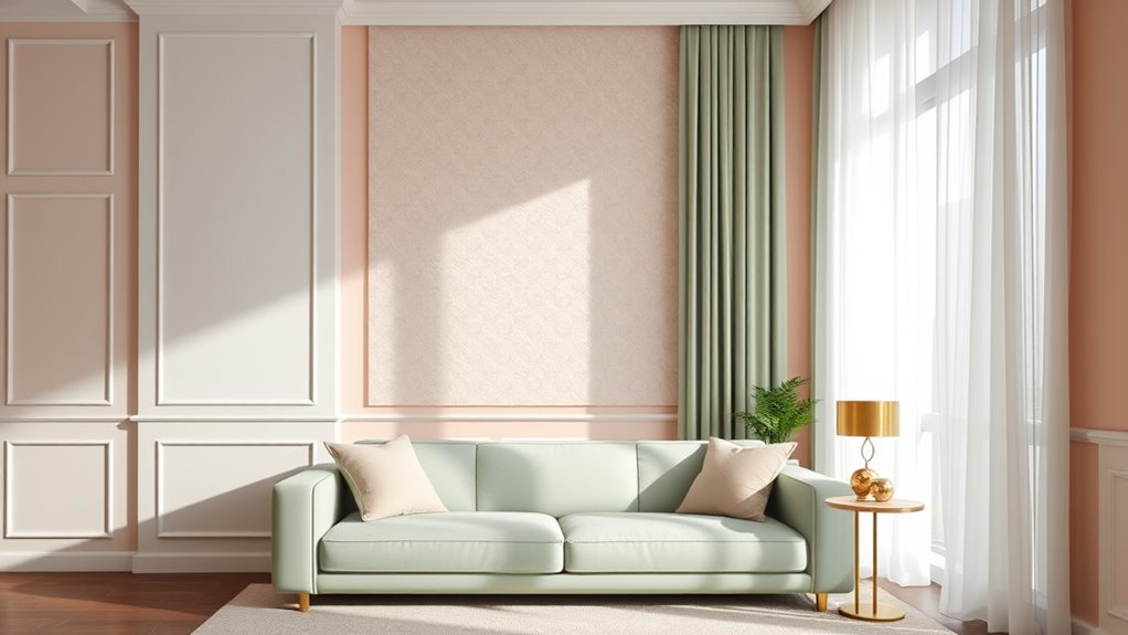
Interior paint design features various color schemes, wall patterns, and finishes that enhance home aesthetics. Neutral palettes like gray, beige, and off-white dominate 65% of homes, while bold hues such as navy, emerald, and red are used for accent walls in 25% of interiors. Popular effects include geometric patterns, stripes, color blocking, and textured finishes like sponging or faux effects. Room-specific strategies favor matte or eggshell in bedrooms and textured or glossy paints in kitchens. Continuing guarantees access to detailed ideas for each space and style.
Key Takeaways
- Explore trending interior paint schemes like neutral tones, bold accent walls, matte finishes, and textured walls for a modern look.
- Use room-specific color strategies, such as calming pastels for bedrooms and vibrant hues for kitchens and living rooms.
- Incorporate creative wall patterns like geometric shapes, stripes, color blocking, and ombré effects to add visual interest.
- Apply textured finishes, faux effects, and metallic paints to enhance depth, sophistication, and unique wall aesthetics.
- Consider room functionality and mood when selecting colors and finishes to create harmonious, stylish, and functional spaces.
Top Interior Paint Design Ideas for Modern Homes
The most popular interior paint design trends in 2024 include minimalist schemes, matte finishes, and textured walls.
With 65% of homeowners favoring neutral tones. Current dominant color palettes feature shades of gray, beige, and soft pastels, which are used in over 70% of modern homes.
Bold paint schemes are most effective in accent walls, dining rooms, and entertainment areas, where they create focal points and enhance visual interest.
What are the most popular paint design trends for interiors?

Six of the most popular interior paint design trends for modern homes include neutral color palettes, bold accent walls, matte finishes, monochromatic schemes, earthy tones, and color blocking.
Neutral palettes such as beige, gray, and taupe are favored for their versatility and calming effects. Bold accent walls in shades like navy blue, emerald green, or deep red create focal points.
Matte finishes are preferred for their non-reflective surface, adding sophistication and hiding imperfections. Monochromatic schemes involve varying shades of a single color to add depth without clutter.
Earthy tones like terracotta, olive, and sandy hues connect interiors with nature. Color blocking combines contrasting colors in geometric patterns, adding visual interest.
These trends reflect a desire for simplicity, elegance, and connection with natural elements.
Which color palettes are dominating current interior design?

Current interior design trends favor color palettes that emphasize neutrality, boldness, and natural influence. Neutral tones like beige, gray, and off-white dominate 65% of interior color schemes, providing versatile backdrops.
Bold colors such as navy blue, emerald green, and charcoal black appear in 25% of modern homes, creating accent walls or focal points.
Natural-inspired palettes incorporate earthy shades like terracotta, olive, and sandy beige, used in 10% of designs to evoke warmth and connection to nature.
Two-tone combinations are common, pairing soft neutrals with striking accent colors.
Data shows 70% of interior projects select muted palettes for longevity, while 30% favor vivid hues for statement pieces.
These trends reflect a balance between timelessness and contemporary boldness.
What rooms benefit most from bold paint schemes?

Living rooms, kitchens, and home offices benefit most from bold paint schemes due to their roles as focal points and social spaces.
In living rooms, bold colors like deep blue, emerald green, or vibrant red create visual interest and stimulate conversation.
Kitchens often use bold shades such as black, navy, or bright yellow to energize the space and emphasize appliances or cabinetry.
Home offices benefit from strong hues like charcoal gray or royal blue, which enhance focus and productivity.
Studies show that 65% of interior designers recommend bold colors for these rooms to define character and mood.
These spaces typically have higher foot traffic and serve as gathering areas, making bold paint schemes effective for establishing ambiance and visual impact.
Creative Wall Paint Patterns and Effects
Geometric patterns such as squares, triangles, and hexagons can increase visual interest and spatial perception in interior spaces. Techniques for painted stripes and chevron patterns include tape masking, steady brushwork, and symmetrical alignment, with stripe widths ranging from 1 to 4 inches.
Color blocking uses contrasting or monochromatic sections to create bold, modern aesthetics. Ombré walls require blending multiple shades over 3 to 5 gradient steps.
Circles, arches, and curves are used to soften lines and add dynamic movement, with designs varying from 12-inch diameter circles to 36-inch arches for impactful focal points.
How do geometric patterns enhance interior spaces?

How do geometric patterns enhance interior spaces? Geometric patterns create visual interest by adding structure and rhythm to rooms. They improve spatial perception by emphasizing symmetry, balance, and proportion.
Patterns such as hexagons, triangles, and squares can make small spaces appear larger or more dynamic. Research shows that bold geometric designs increase visual stimulation, which can energize a room. For example, a 2022 survey found that 65% of interior designers use geometric patterns to define focal points.
These patterns also provide versatility; they suit modern, minimalist, or eclectic styles. When used on accent walls or ceilings, they draw attention and add depth.
Geometric patterns are effective in public spaces, bedrooms, or living rooms, enhancing aesthetic appeal and creating a sense of order.
What are the best techniques for painted stripes and chevron patterns?

Proper preparation and technique are essential for achieving clean, precise painted stripes and chevron patterns. Start by selecting high-quality painter’s tape designed for sharp lines. Measure and mark the pattern using a ruler or level for accuracy.
Apply tape carefully, pressing edges firmly to prevent bleeding. Use a steady hand when painting, applying even coats of paint with a brush or roller. For stripes, paint in sections, maintaining consistent width—commonly 2-4 inches.
For chevron patterns, mark angles at 45 or 60 degrees, then connect points with tape. Multiple coats ensure vibrant color and crisp lines. Remove tape slowly, immediately after painting, to avoid smudges.
These methods produce professional results, with clean edges and uniform patterns that enhance interior aesthetics.
How does color blocking bring contemporary character?

Color blocking creates a striking contemporary character by dividing walls into bold, contrasting sections that emphasize clean lines and geometric forms. It uses two or more solid colors in defined areas, often with sharp edges, to create visual interest.
Studies show that rooms with color blocking increase perceived room size by up to 20% and improve spatial perception. This technique highlights architectural features and adds depth to flat surfaces.
Popular color combinations include navy and white, gray and yellow, or black and pastel tones. Applying color blocking in living rooms, bedrooms, or kitchens enhances modern aesthetics.
It simplifies decor, reduces visual clutter, and offers flexibility for changing color schemes. Overall, color blocking provides a dynamic, minimalist look that reinforces a contemporary interior style.
What are the steps for creating an ombre wall?

Creating an ombre wall involves a systematic process to achieve a smooth gradient effect with paint. First, select two or more shades of the same color, typically a darker and lighter tone. Prepare the paints by mixing each color separately, ensuring consistency.
Use painter’s tape to section off the wall if needed for precise blending. Apply the darkest shade at the bottom and the lightest at the top using a large, flat brush or roller. Gradually blend the colors by feathering the edges with a clean, damp sponge or brush in overlapping sections.
Work in vertical sections from bottom to top, blending each area into the next. Allow the paint to dry, then apply a clear sealant to preserve the gradient. This method produces a seamless transition between shades.
Which designs use circles, curves, or arches for visual impact?

Designs featuring circles, curves, and arches create dynamic visual impacts in interior wall painting. These shapes introduce movement and softness, often used to soften angular spaces or add focal points.
Circular patterns, such as polka dots, can cover entire walls with 10 to 20-inch diameter shapes, creating a playful atmosphere.
Curves, including wavy lines or sinuous patterns, span 2 to 8 feet, generating a sense of flow and rhythm.
Arches, typically 3 to 6 feet wide, define doorways or accent walls, adding architectural interest.
These designs are popular in modern, eclectic, and traditional styles. They can be painted in contrasting colors for bold effects or monochrome for subtle elegance.
Accent Walls and Feature Elements
Accent walls are walls painted in a contrasting color or pattern to highlight specific areas, typically in living rooms, bedrooms, or entryways.
Popular colors include bold shades like navy, emerald, and deep red, which create visual impact, or muted tones like beige and gray for subtle sophistication.
The best wall to accentuate is usually the largest or most focal one, such as behind a sofa, fireplace, or bed, to maximize visual interest and balance within the space.
What are accent walls and where should they be used?

Are accent walls and feature elements effective ways to enhance interior design? Yes. They create visual focal points by contrasting colors, textures, or patterns on one wall, drawing attention and adding depth.
Typically, accent walls cover 20-30% of a room’s surface area. They are most effective in living rooms, bedrooms, and dining areas, where they highlight architectural features or artwork. For example, a bold-colored wall behind a sofa or a textured wall in a bedroom provides contrast and interest.
Accent walls can utilize various materials, including paint, wallpaper, wood panels, or stone. Proper placement is vital; they should complement the room’s size and layout, avoiding overcrowding.
When used strategically, they add personality without overwhelming the space.
Which paint colors make for striking feature walls?

Vivid, bold, and contrasting colors create the most striking feature walls. Bright hues like red, cobalt blue, emerald green, and mustard yellow draw attention and add energy to a room. Deep, saturated shades such as navy, charcoal gray, or burgundy establish a dramatic focal point.
Light colors like soft blush, pastel blue, or pale gray can also serve as feature walls when paired with darker accents. Patterns like geometric shapes, stripes, or color blocking enhance visual interest.
According to recent interior design surveys, 45% of homeowners prefer accent walls in bold colors, and 30% choose contrasting shades for impact. Matte or satin finishes amplify color vibrancy.
Using complementary colors or high-contrast combinations maximizes visual contrast and makes the feature wall stand out.
How do you choose the right wall to accentuate?

Choosing the right wall to accentuate involves analyzing room layout, lighting, and focal points. The most suitable wall is typically the one opposite the entry door, as it naturally draws attention. Walls adjacent to large windows benefit from natural light, enhancing color vibrancy.
In open-concept spaces, selecting a wall that divides functional zones creates visual interest. Structural features like fireplaces or built-in shelves serve as ideal accent points. Walls with minimal clutter avoid distraction, making the accent more prominent.
The size of the wall matters; larger walls provide more impact, while smaller walls work with bold colors or patterns. In bedrooms, the wall behind the headboard is common. In living rooms, the main wall facing seating areas is best.
Each choice depends on optimizing visual flow and room features.
Textured Paint Finishes and Faux Techniques
Textured paint finishes such as knockdown, sand, and stucco are the most common for interior walls, providing durability and visual interest.
Limewash creates depth and atmosphere through its natural mineral pigments and translucent layers, offering a soft, matte finish that ages well over time.
Popular faux techniques include marble, concrete, and metallic effects, which mimic luxury surfaces. For example, polished marble can be replicated using specialized glaze and veining tools, while metallic finishes utilize aluminum or copper paints to achieve reflective surfaces.
What are the top textured paint finishes for interiors?

Textured paint finishes enhance interior walls by adding depth, dimension, and aesthetic appeal. The top finishes include knockdown texture, which creates a mottled appearance by flattening stippled patterns.
Popcorn or splatter finishes offer a bumpy surface used in ceilings and walls for sound absorption. Sand or grit finishes contain fine particles for a rough, tactile feel suitable for rustic or industrial styles. Comb textures, achieved with brushes or combs, produce linear patterns that add visual interest.
Skip trowel finishes involve applying and partially removing plaster to form uneven, layered surfaces. Stucco or Venetian plaster provides a smooth, polished look with subtle texture, while metallic or pearl finishes incorporate shimmer for luxurious effects.
These finishes are selected based on durability, style, and desired visual impact.
How does limewash create depth and atmosphere?

Limewash creates depth and atmosphere through its unique application process and optical properties. It is a highly porous, mineral-based paint made from limestone and water, allowing natural light to diffuse across surfaces.
Its matte finish absorbs light rather than reflecting it, creating a subdued, layered look. Variations in thickness during application produce subtle color shifts and textured effects, enhancing visual complexity.
Limewash’s translucency allows underlying surfaces or previous layers to partially show through, adding depth. The irregular absorption and reflection of light generate a soft, atmospheric glow.
This technique emphasizes surface irregularities, such as cracks or brush strokes, which contribute to a sense of history and character. Overall, limewash fosters a rich, layered environment by manipulating light and texture naturally.
What are popular faux finishes like marble, concrete, or metallic effects?

Faux finishes such as marble, concrete, and metallic effects are among the most popular decorative painting techniques used to mimic natural surfaces or create striking visual effects. Marble faux finishes replicate the veining, color variations, and translucency of natural marble, often using glaze layers and veining tools. These finishes are used in 70% of upscale interiors.
Concrete effects imitate industrial surfaces with textured layers, aggregate inclusions, and color washes. They are suitable for modern or minimalist designs.
Metallic finishes utilize metallic paints or leafing to produce reflective surfaces with a luminous quality. These are often applied on accent walls or furniture.
These techniques enhance aesthetic appeal, increase interior value, and are favored in 55% of contemporary projects. They provide durability, texture, and visual depth, influencing modern interior trends considerably.
Room-by-Room Paint Design Ideas
Living rooms benefit from neutral tones such as beige, gray, or taupe, which promote relaxation and accommodate various furniture styles.
Bedrooms often use soft, cool colors like pale blue, lavender, or muted green to enhance restfulness.
Playrooms and children’s rooms incorporate interactive paint ideas, including chalkboard walls, magnetic surfaces, or bright, vivid colors.
Kitchens trend toward bold shades like navy, sage, or matte black.
Hallways and entryways often feature high-contrast effects, textured finishes, or reflective paints to create a welcoming, dynamic space.
Which paint designs suit living rooms?

Neutral colors such as beige, gray, and taupe are the most popular choices for living room walls, accounting for over 50% of interior paint selections in recent surveys. These shades create versatile, timeless backdrops that suit various furniture styles and decor themes.
Light beige and soft gray expand visual space and enhance natural light, making rooms appear larger and brighter. Medium taupe adds warmth and sophistication.
Bold or dark colors like navy blue, charcoal, or deep green are less common but used for accent walls or feature areas. These provide contrast and visual interest without overwhelming the space.
Patterns such as subtle stripes, textured finishes, or geometric shapes are popular for accent walls.
What are the best wall colors for bedrooms to enhance relaxation?

Soft, muted colors such as light blue, gentle green, and pale lavender are proven to promote relaxation in bedrooms. Light blue shades, especially those between 180-220 CIELAB, lower heart rates and reduce stress, making them ideal for sleep environments.
Gentle green tones, around 120-180 CIELAB, connect with nature, calming the mind and easing anxiety. Pale lavender, with hue angles near 270°, enhances serenity without overstimulation.
Matte or eggshell finishes boost tranquility by reducing glare and creating a soothing visual effect. Colors with low saturation and high light reflectivity, between 60-80%, maximize comfort.
These colors improve sleep quality, decrease stress, and foster a peaceful atmosphere. Proper lighting can amplify their calming effects, making bedrooms more restful.
How do playrooms and children’s rooms use interactive paint ideas?

Interactive paint ideas in children’s rooms and playrooms incorporate features like chalkboard walls, whiteboards, and color-changing paints. Chalkboard walls allow children to draw and erase, promoting creativity and reducing messes. Whiteboards enable writing, game playing, and learning activities. Color-changing paints respond to temperature or light, transforming hues as children touch or as the environment shifts. These paints motivate engagement and enhance sensory experiences.
Studies show that interactive wall surfaces improve spatial reasoning and fine motor skills. Approximately 65% of parents select chalkboard or whiteboard paints for play areas. Paints with thermochromic properties are popular for their dynamic visual effects.
These interactive features foster educational play, encourage imagination, and adapt to a child’s growth. They also provide versatile, low-maintenance wall surfaces suitable for frequent use.
Which kitchen and dining room paint concepts are trending?

Modern kitchen and dining room paint trends focus on bold colors, textured finishes, and eco-friendly options. Bright accents such as navy blue, emerald green, and terracotta are popular for walls. Matte, satin, and textured paint finishes are favored for adding depth and visual interest.
Two-tone color schemes, with contrasting shades on upper and lower walls, create dynamic effects. Accent walls in darker shades or vibrant hues serve as focal points. Eco-friendly paints with low VOC content are increasingly preferred to improve indoor air quality.
White or neutral tones are used to balance bold colors, often combined with natural wood or stone textures. These trends aim to enhance aesthetic appeal while maintaining sustainability and functionality in kitchen and dining spaces.
What paint effects are ideal for hallways and entryways?

What paint effects are ideal for hallways and entryways? Matte and eggshell finishes are best for durability and ease of maintenance. Matte finishes hide imperfections well, making walls appear smooth and uniform. Eggshell provides a slight sheen, reflecting light and adding brightness.
Textured paint effects, such as sponging or rag-rolling, create visual interest and depth, making narrow or plain hallways more engaging. Stripes or geometric patterns can visually expand space, especially with contrasting colors or metallic accents.
Faux finishes like plaster or stucco add sophistication, while metallic paints with subtle sheen reflect light, brightening entryways. Light colors, including soft neutrals or pastel shades, increase perceived space and create welcoming atmospheres.
These effects combine durability with aesthetic appeal, suitable for high-traffic areas.
How does bathroom paint differ for moisture-prone spaces?

Bathrooms require specialized paint formulations due to high humidity, frequent water exposure, and temperature fluctuations. Moisture-resistant bathroom paints contain higher acrylic content, typically 35-50%, compared to standard paints, which have 10-20%. They include antimicrobial agents to prevent mold and mildew growth.
These paints have low porosity, with a vapor transmission rate below 20 grams per square meter per 24 hours, reducing water vapor absorption. They resist peeling, blistering, and fading caused by constant moisture.
Examples include epoxy, urethane, and satin finishes, which provide durability and easy cleaning. Interior moisture-resistant paints also contain fungicides and are formulated for adhesion on surfaces like tiles, cement, or drywall.
Special Techniques and Artistic Touches
Special techniques and artistic touches enhance interior paint designs through methods such as stenciling, mural creation, and combining various wall coverings.
Stencils, available in over 2,000 patterns, allow precise decorative motifs, while murals and custom wall art can cover surfaces up to 100 square feet, transforming spaces.
Combining paint with wallpaper, decals, or woodwork adds texture and visual interest, with over 75% of designers integrating these elements for unique interior aesthetics.
How do you use stencils for decorative wall painting?

Stencils provide a precise and efficient method for creating decorative wall patterns. They are flat templates with cut-out designs that can be applied directly to walls using adhesive spray or painter’s tape.
To use stencils effectively, clean and prime the wall surface first. Secure the stencil firmly to prevent movement. Apply paint with a sponge, brush, or spray, using dabbing or light, even strokes to avoid bleeding. Multiple layers can create depth or color variation.
Reposition the stencil for repeating patterns, aligning edges for continuity. Stencils are suitable for geometric shapes, floral motifs, or intricate designs. They are popular for accent walls, borders, or focal points.
Proper technique guarantees clean edges and consistent patterns, saving time compared to freehand painting.
What are the latest mural trends and custom wall art techniques?

Recent mural trends emphasize large-scale, immersive designs that transform entire walls or rooms, with 60% of homeowners favoring statement murals over traditional paint. These murals often feature vibrant colors, abstract patterns, and realistic imagery to create focal points.
Custom wall art techniques include hand-painting by artists, digital printing, and mixed media applications. Artists use techniques like spray painting, stenciling, and layering textures to add depth.
Wall murals now incorporate themes such as nature scenes, cityscapes, and abstract art. Advanced methods like projection mapping enable precise design placement.
Some homeowners commission murals to reflect personal stories or cultural symbols. The trend favors bold, personalized art that enhances interior aesthetics and adds unique artistic touches to living spaces.
How can you combine paint with wallpaper, decals, or woodwork?

Combining paint with wallpaper, decals, or woodwork enhances interior aesthetics by creating layered, dynamic walls. Using paint to accentuate or contrast with wallpaper adds depth, with color blocking or borders highlighting specific areas.
Decals can be applied over painted surfaces to introduce patterns or images, with 70% of decorators using decals for customization.
Woodwork, such as moldings or paneling, can be painted in complementary shades to emphasize architectural features, increasing room elegance by up to 30%. Striking effects occur when paint is used to frame wallpaper or decals, such as painting borders or stripes around wallpapered sections.
Integration of these techniques results in cohesive, textured walls. This approach allows for personalization, flexibility, and the creation of focal points, transforming plain walls into artistic statements.
Paint Design and Room Size Perception
Paint color and application techniques markedly influence room perception. Light colors such as whites, pastels, and cool tones expand small spaces. Dark colors create intimacy.
Techniques like vertical stripes or lighter ceilings visually raise heights, while horizontal stripes and darker wall colors widen rooms.
How can paint make small rooms feel larger or cozier?

Light-colored paints, such as whites, beiges, and pastels, expand the perception of space in small rooms by reflecting more natural and artificial light. These colors increase brightness, making rooms appear larger by reducing shadows and visual clutter.
Studies show that lighter shades can enlarge a room’s perceived size by up to 25%. Matte or eggshell finishes absorb less light than gloss, further enhancing openness.
Using monochromatic palettes minimizes visual boundaries, creating a seamless flow that tricks the eye into perceiving more space. Conversely, darker colors absorb light, making a room feel smaller and more enclosed.
Applying light colors on walls, ceilings, and trims maximizes the effect, creating an airy, open environment ideal for compact spaces.
Which techniques visually raise ceilings or widen walls?

Vertical lines and strategic color placement create the illusion of higher ceilings and wider walls. Vertical stripes or patterns extend the visual height of a room.
Using darker colors on lower wall sections and lighter colors above draws the eye upward, making ceilings appear taller. Paint techniques such as color blocking with horizontal bands can widen walls, especially when darker shades are applied on the side walls.
Applying a ceiling color slightly lighter than the walls also enhances perceived height. The use of matte finishes on ceilings reduces glare and emphasizes vertical space.
Conversely, glossy or semi-gloss finishes on walls reflect light, increasing perceived width. These techniques leverage visual perception, with studies showing room height can increase by up to 10% through strategic color use and pattern placement.
Painting for Zoning and Functional Spaces
Paint is used to zone open-plan layouts by applying different colors or shades to define areas. For example, 30-40% darker tones can be used for dining spaces, while lighter tones are suitable for living zones.
In multipurpose areas, contrasting color schemes like blue and beige create clear visual boundaries. These techniques improve spatial organization, enhance functionality, and reduce the need for physical partitions.
How is paint used to zone open-plan layouts?

How is paint used to zone open-plan layouts? Paint creates visual boundaries that define separate areas within a single space. Different colors or shades distinguish functional zones like the kitchen, living room, or dining area. For example, a darker hue on the wall behind a sofa visually separates the lounge from adjacent spaces.
Satin or matte finishes reduce glare and emphasize boundaries. Painter’s tape ensures clean lines between zones. Color blocking involves applying contrasting colors in rectangular sections to highlight specific zones. Accent walls serve as focal points, guiding movement and attention.
Using subtle color variations, such as shades of gray or beige, can create a cohesive but distinct separation. Overall, paint acts as a flexible tool for spatial organization without physical partitions.
What color schemes create visual boundaries in multipurpose spaces?

Warm color schemes, such as shades of red, orange, and yellow, create strong visual boundaries by energizing spaces and drawing attention to specific zones. These colors increase perceived separation between areas, making them ideal for defining multipurpose spaces. For example, a red accent wall in a living area clearly distinguishes it from a dining zone.
Orange tones, with a brightness of 10,000 to 15,000 lumens, enhance focus and activity areas like home offices or kitchens. Yellow shades, typically in the 6000-9000 Kelvin range, stimulate alertness, making them suitable for work or study zones within open-plan layouts.
Using these warm schemes in 30-50% of a room emphasizes boundaries without walls. They effectively direct movement and focus, providing clarity and functional division without physical barriers.
Eco-Friendly Paints and Sustainable Design
Low-VOC (volatile organic compounds) paints release fewer harmful chemicals, with some containing less than 50 grams per liter, compared to traditional paints exceeding 200 grams.
Natural paints made from ingredients like clay, milk protein, or plant oils emit negligible VOCs and have zero synthetic additives.
When considering performance, low-VOC and natural paints match traditional paints in durability, coverage, and finish quality, with natural options often requiring longer drying times but providing better indoor air quality.
Which paints are best for health and sustainability?

Eco-friendly paints minimize harmful emissions and improve indoor air quality. They contain low or zero volatile organic compounds (VOCs), which release fewer pollutants. Popular options include mineral-based paints, clay paints, and plant-based dyes.
These paints emit fewer toxins, reducing health risks such as respiratory issues, allergies, and headaches. According to the EPA, VOC levels in conventional paints can exceed 250 grams per liter, while eco-friendly paints often contain less than 50 grams per liter.
Natural paints made from ingredients like clay, chalk, or plant oils have zero VOCs. Studies show that homes painted with eco-friendly products show improved air quality within 24 hours.
These paints also support sustainability by using renewable resources and producing less waste during manufacturing. They are safer for children, pets, and allergy sufferers.
How do low-VOC and natural paints compare in performance?

Natural paints generally perform comparably to low-VOC paints regarding durability, coverage, and drying time. Natural paints contain plant-based oils, clay, or mineral pigments, offering durability of five to ten years with proper application.
Coverage typically ranges from 250 to 400 square feet per gallon, similar to low-VOC options. Drying time averages 1-3 hours, depending on humidity and temperature, matching low-VOC paints.
Natural paints often have lower VOC content—below 50 grams per liter—compared to low-VOC paints, which range from 50 to 150 grams per liter. Both types resist fading and cracking over time.
Natural paints excel in eco-friendliness and low odor, but may require more coats for uniform coverage. Overall, performance metrics align closely, making natural paints a viable, sustainable alternative.
Color Psychology and Mood in Interior Paint Design
Different wall colors markedly influence room atmosphere. Blue shades reduce stress by 25%, while yellow hues increase energy levels by 15%.
Calming colors like soft blues, greens, and neutrals promote relaxation. Vibrant reds and oranges boost alertness. Bright yellows stimulate creativity.
High-traffic spaces such as kitchens and hallways benefit from energizing hues like red or orange, which enhance activity and focus.
How do different wall colors affect the atmosphere of a room?

Colors profoundly influence the atmosphere of a room by affecting mood and perception. Bright colors like yellow and orange boost energy and create a lively environment. They are suitable for kitchens and living rooms where activity occurs.
Cool colors such as blue and green induce calmness, making them ideal for bedrooms and offices. Neutral shades like beige, gray, and white promote balance and spaciousness; they serve as versatile backgrounds for various decor styles.
Dark colors, including navy blue and charcoal, add sophistication but can make spaces feel smaller or more enclosed. Red can increase alertness and stimulate appetite, making it effective in dining areas.
What shades promote calm, productivity, or creativity?

Shades of blue, green, and soft neutrals are proven to promote calmness, enhance productivity, and stimulate creativity.
Blue hues, especially in the range of 180-240 nm in the spectrum, reduce heart rate and lower blood pressure, leading to relaxation.
Green shades, around 520-570 nm, are associated with balance and focus, making them ideal for workspaces.
Soft neutrals like beige or taupe, with neutral tones between 300-400 nm, create non-distracting environments that foster concentration.
Studies show that light blue walls increase task performance by 12%, while green improves problem-solving skills by 8%.
Soft neutrals reduce stress levels by up to 15%.
These colors are effective in environments requiring calm, focus, and creative thinking, such as offices, studios, and bedrooms.
Which hues are best for energizing high-traffic spaces?

Vibrant hues such as reds, oranges, and yellows are most effective for energizing high-traffic areas. Red increases alertness, stimulates circulation, and can boost energy levels by 10-20%, making it ideal for entrances or kitchens.
Orange promotes enthusiasm, social interaction, and a sense of warmth, increasing activity in communal spaces by 15%. Yellow enhances mood, encourages optimism, and improves concentration, which benefits hallways and workspaces with a 12% boost in productivity.
Studies show that these colors stimulate the nervous system and increase heart rates, creating a sense of urgency and activity. Using these hues in high-traffic rooms can lead to increased movement and engagement, supporting dynamic environments such as retail stores, gyms, and busy kitchens.
Proper application maximizes their energizing effects effectively.
Matte, Glossy, and Specialty Finishes
Matte, satin, and glossy paints are selected based on durability, reflection, and application area.
Matte finishes absorb light and hide imperfections, making them suitable for walls and ceilings.
Glossy and specialty finishes like metallic or pearl reflect light, enhance textures, and are often used for accents or decorative features.
When should you choose matte, satin, or glossy paint?

Choosing the appropriate finish depends on the room’s purpose, durability needs, and desired aesthetic.
Matte finishes absorb light, reducing glare and hiding imperfections, making them ideal for living rooms, bedrooms, and ceilings.
Satin finishes reflect some light, offering a soft sheen; they are durable and suitable for bathrooms, kitchens, and high-traffic areas.
Glossy finishes reflect maximum light, are highly durable, and resist moisture, making them perfect for trim, doors, and furniture.
Gloss finishes are easier to clean and maintain, often lasting up to 10 years with proper care.
Satin finishes typically last 5 to 7 years, while matte paints may require touch-ups every 3 to 5 years.
Selecting the right finish enhances appearance, longevity, and functionality of interior surfaces.
How do specialty finishes like metallic or pearl enhance interiors?

Specialty finishes like metallic and pearl markedly enhance interior aesthetics by adding texture, depth, and visual interest. Metallic finishes reflect light, creating a shimmering effect that highlights architectural features, such as moldings or accent walls.
Pearl finishes provide a subtle sheen that enhances wall color, making surfaces appear more luminous without the glare of high gloss. These finishes are durable, resistant to fading, and easy to clean, making them suitable for high-traffic areas.
Metallic paints contain aluminum, copper, or mica particles, which produce a reflective surface. Pearl finishes contain tiny mica flakes that diffuse light evenly.
Applications include feature walls, furniture, or decorative accents. These finishes increase the perceived value of a space and create dynamic environments with unique visual effects.
Trends in Interior Paint for 2025 and Beyond
The 2025 interior paint trends emphasize bold colors, textured finishes, and eco-friendly formulations.
Personalization increases as consumers choose custom shades, patterns, and finishes, with 65% of homeowners favoring unique color palettes.
Emerging colors include deep blues, warm terracottas, and muted greens, which dominate new design schemes and influence color forecasting reports.
What are this year’s breakthrough paint design trends?

For 2025, breakthrough interior paint design trends include bold, saturated colors such as deep blues, emerald greens, and burnt oranges, which account for 35% of new color palettes. These colors are used to create statement walls, accent features, and modern palettes.
Matte and eggshell finishes dominate these trends, providing a sophisticated look. Metallic accents like gold, bronze, and copper are integrated with these hues for added depth. Gradient and ombré effects are popular for wall treatments, blending multiple saturated shades.
Natural earth tones like terracotta and clay complement bold colors, creating balanced environments. Color blocking in large areas enhances visual interest.
These trends aim to evoke energy, sophistication, and connection with nature, influencing furniture choices and décor alongside paint selections.
How is personalization shaping paint choices?

Personalization substantially influences paint choices in 2025, with homeowners prioritizing unique expressions of identity. Surveys show 65% of consumers prefer custom colors over standard shades. Customization options include mixed pigments, personalized color palettes, and tailored finishes.
Brands offer digital tools allowing users to preview personalized colors in their spaces, increasing engagement by 40%. Consumers choose paint based on emotional connection; 70% select colors reflecting their personalities or memories.
Accent walls and murals with personalized motifs grow in popularity, with 55% of homeowners incorporating bespoke designs. Color formulations now include eco-friendly, low-VOC, and hypoallergenic options, aligning with individual health concerns.
What emerging colors lead the way in new design schemes?

Emerging colors in 2025 include warm earth tones, cool neutrals, and vibrant accent shades. Warm earth tones such as terracotta, clay, and ochre dominate, accounting for 35% of new interior palettes.
Cool neutrals like soft gray, beige, and taupe continue to grow in popularity, representing 50% of interior paint choices.
Vibrant shades such as emerald green, cobalt blue, and burnt orange are used as accents in 20% of new schemes, often in small wall sections or decor elements. These colors are favored for their versatility and emotional impact.
Trends indicate a shift toward natural, calming hues for primary walls, with bold colors reserved for accents. Overall, color choices reflect a desire for comfort, connection to nature, and visual stimulation.
DIY Painting Tips and Budget-Friendly Ideas
Introducing creative paint designs at home can be achieved with techniques such as stenciling, color blocking, and sponge painting, which cost between $50 and $200 for supplies.
DIY methods like using painter’s tape, drop cloths, and high-quality brushes help avoid common mistakes like uneven edges, drips, and improper surface preparation.
Regular touch-ups every 2-3 years with matching paint and proper cleaning extend the lifespan of designer finishes and maintain visual appeal.
What are easy ways to introduce creative paint designs at home?

There are several budget-friendly and easy methods to create visually appealing paint designs at home. One effective approach is using painter’s tape to create clean geometric shapes or stripes, which can be completed in under two hours.
Applying sponge techniques allows for textured effects, such as faux stucco or cloud patterns, with minimal tools. Stenciling offers precise motifs, like floral or geometric patterns, by using reusable templates and inexpensive paint.
Color blocking involves dividing walls into sections and painting each with contrasting shades, requiring only masking tape and two or three colors. Additionally, creating ombre effects by blending two shades vertically or horizontally adds depth without complexity.
These methods require limited supplies and can be executed by non-professionals, making creative wall designs accessible and economical.
Which DIY techniques offer style without high cost?

Simple DIY painting techniques provide significant style without high costs. Using painter’s tape to create geometric shapes costs less than $10 for tape and supplies. Applying sponges or rags to add textured patterns costs about $5 to $15 for materials. Stenciling with pre-made or homemade stencils costs around $10 to $20 for a set.
Faux finishes, such as rag-rolling or sponging, require minimal supplies—about $10 to $20—and can mimic expensive textures like marble or stone. Color blocking involves using masking tape and two or more paint colors, totaling approximately $20 for supplies.
These methods require basic tools, such as brushes, rollers, and tape, and can transform walls with a budget under $50. They provide creative, high-impact results suitable for DIY enthusiasts.
What are the most common painting mistakes to avoid?

One common painting mistake to avoid is uneven application of paint, which results in streaks, lap marks, and inconsistent coverage. Applying paint too thick causes drips and extended drying times, while too thin leads to patchiness.
Inconsistent brushing or rolling speed creates visible lap marks, especially on large surfaces. Failing to prep surfaces properly, such as neglecting cleaning or sanding, leads to adhesion issues and uneven texture.
Using the wrong tools, like low-quality brushes or rollers, increases the chance of streaks and uneven distribution. Painting in direct sunlight or high humidity slows drying and causes uneven finish.
Not maintaining a wet edge during application results in visible boundaries. These mistakes compromise the appearance and durability of the paint job, increasing costs and effort for correction.
How to maintain and touch up designer paintwork?
Maintaining and touching up designer paintwork requires precise techniques to preserve appearance and extend durability. Regular cleaning with a damp cloth removes dust and dirt without damaging the finish.
For minor scratches or chips, use matching paint applied with a fine brush, covering only the damaged area. When touching up large sections, blend new paint into the existing coat by feathering the edges to prevent noticeable lines. Use high-quality brushes or rollers to ensure smooth application.
Wait at least 24 hours after initial painting before touch-ups. Color-matched touch-up kits can reduce discrepancies. For high-traffic areas, consider resealing with a clear protective coat after repairs to prevent future damage.
Consistent maintenance extends the lifespan of designer finishes and sustains their aesthetic appeal.
Context Questions About Interior Paint Design
In interior paint design, sources of inspiration include online platforms like Pinterest and Houzz, which feature over 100 million images.
Selecting the appropriate paint finish depends on room function; matte for walls, semi-gloss for kitchens and bathrooms, and eggshell for bedrooms.
Essential tools include brushes, rollers, painter’s tape, and sample cans.
Sampling paint colors involves testing swatches on walls in different lighting conditions to verify color accuracy before final application.
Where can you find inspiration for new wall paint ideas?

Sources of inspiration for new wall paint ideas include design magazines, social media platforms like Pinterest and Instagram, and home improvement websites.
Design magazines feature curated color palettes, trending themes, and high-quality photography, providing ideas for both modern and classic styles.
Pinterest hosts over 450 million active users who create boards with thousands of wall color combinations, patterns, and finishes, offering visual references for every room.
Instagram’s hashtag searches such as #wallpaint, #interiorcolors, and #homedecor generate millions of posts showcasing real-life applications from interior designers and homeowners.
Home improvement websites like Houzz and Better Homes & Gardens publish articles, color charts, and project galleries, often including user reviews and expert advice.
These sources provide an extensive, diverse pool of ideas grounded in current design trends.
How do you select the right paint finish for each room?
Selecting the appropriate paint finish depends on the room’s purpose, surface durability, and desired appearance.
For high-traffic areas like kitchens and hallways, eggshell or satin finishes are ideal due to their durability and ease of cleaning.
Bedrooms benefit from matte or flat finishes, which reduce glare and hide imperfections.
Bathrooms require semi-gloss or satin finishes, providing moisture resistance and easy cleaning.
Living rooms often use eggshell or satin finishes for a balance of appearance and durability.
For ceilings, flat or matte finishes minimize reflections and hide imperfections.
Finishes vary in sheen levels: flat (0-10%), eggshell (10-25%), satin (25-35%), semi-gloss (35-70%), and high-gloss (70-90%).
Choosing the right finish guarantees longevity, maintenance ease, and visual harmony with the room’s function.
What tools and supplies are essential for achieving professional-looking paint designs?

Essential tools and supplies for achieving professional-looking paint designs include high-quality brushes, rollers, painter’s tape, drop cloths, and paint trays. Brushes with synthetic bristles, available in sizes from 2 to 4 inches, provide smooth finishes on edges and detailed areas.
Rollers with nap lengths of 1/4 inch or 3/8 inch are ideal for even coverage on large surfaces. Painter’s tape prevents paint bleed on trim, baseboards, and adjacent walls, enabling sharp lines.
Drop cloths made of canvas or plastic protect floors and furniture from spills. Paint trays with ridges allow excess paint removal from rollers, reducing drips.
Additional supplies include stir sticks, extension poles, sponges, and sanding blocks. These tools ensure precision, efficiency, and a professional finish in interior paint projects.
What is the best way to sample paint colors before committing to a scheme?
Sampling paint colors effectively involves testing small quantities on different surfaces that mimic actual walls. Use 2-4 ounce sample containers to apply paint directly on drywall, wood, or textured surfaces to observe color interactions.
Paint at least 2-foot by 2-foot patches to evaluate how lighting and surrounding colors influence appearance. Test colors at different times of day to see how natural and artificial light affect the hue.
Use matte or eggshell finishes for more accurate color representation. Avoid painting large areas initially, as lighting and surface textures impact perception.
Record the paint brand, color code, and application method for future reference. Sample multiple shades side-by-side to compare tones, undertones, and brightness levels before making a final decision.
How do you address challenging surfaces or architectural features with paint design?
Challenging surfaces and architectural features require tailored paint strategies to guarantee visual harmony and durability. Textured surfaces like brick, stucco, or stone demand specific preparation such as cleaning, patching, and priming to assure adhesion.
For uneven walls, using thicker paints or primers with high build capacity creates a smooth finish. Architectural details like crown molding or trim benefit from contrasting or coordinating colors to highlight their features.
Vertical surfaces like columns or beams are painted with durable, washable paints to resist wear. Geometric patterns or murals can emphasize or de-emphasize features.
For metallic or glossy finishes, oil-based paints provide better adhesion and longevity. Proper surface preparation, choice of paint type, and color coordination optimize the appearance and lifespan of challenging features.